Visualising Discovery Data
Re-imagining data from the Southern Ocean Water explorations of 1926-1951.
Gil Dekel g.dekel@soton.ac.uk Feb 2026
How can we encode data, reimagine it and transform it into visual art? In a project to visualise historical records from the Discovery Investigations 1926-1951, I have translated the oceanographic data into proportional parameters. These parameters were then mapped onto visual compositions, yet were not made into descriptive visualisations such as graphs, but rather into art.
Using ChatGPT, themes were identified and extracted from the data, and their prominence was ranked. These themes were then quantified and reenvisioned as visual structures. The resulting artistic works allow the data to be experienced as patterns, rhythms, and spatial relationships, inviting a sensory engagement beyond descriptive representation.
The arts/visualisation created are:
Data visualisation is a process of turning information into charts, graphs or images to make patterns and relationships easier to understand. My project extends beyond standard data visualisation into what may be called artistic visualisation. The project aims to clarify data by transforming it into new expressive forms. The forms are grounded in the data directly and bound by it. Yet, they have been reworked and evolved into an artistic dimension, aiming to invite interpretation, emotion and sensory engagement rather than fixed meaning.
Data visualisation and artistic response share a common impulse. Both aim to make the invisible visible. In both cases, underlying structures are translated into forms that can be perceived, whether through graphs, patterns, or the more expressive visual language of art.
The difference lies in intention: data visualisation seeks clarity, structure and readability, while artistic response invites personal interpretation, emotional resonance, and even multiple perspectives (including contradictory ones) at once. In art, “the viewer completes the painting”1, meaning that art is very much aware of the user’s own contribution to the message. In this sense, both practices translate complexity, but one attempts to stabilise it, while the other attempts to expand on it.
In my project, data is not illustrated descriptively but encoded into visual parameters (colour, geometry and spatial proportion), which align with how artists often translate experiences into visuals. Artistic expression involves interpreting ideas.
Yet, there is a duality in my project, as I am both a designer/academic and an artist. Design is ‘functional art’. It uses artistic expression but intends to produce a clear and communicative message - data visualisations. As both a designer/artist, I sense the tension between constraint and freedom. The dataset imposes rules, proportions and relationships that I have respected, in a logical process. At the same time, I aimed for artistic creativity, which is not mechanical; rather, it involves intuition, emotion and personal engagement.
There is always a resolution to this duality. While I was bound to follow the numerical systems’ boundaries, still there was a space for interpretation, rhythm and meaning within the boundaries. This space allowed for creativity, such as coming up with an idea for one image, where I ‘transformed’ Piet Mondrian’s famous grids into a visual of metal grid laid on the ocean. This idea did not emerge from the dataset itself, but out of creative thinking. I saw this image in my mind after analysing the dataset and thinking of Piet Mondrian at the same time. At that point, the connection was made. The proportions of the grid drawn in the image is still bound by the datasets (as explained below). Yet, transforming a painted grid into image of a metal structure laid on the ocean was an act of imagination.
Even within structured methods, creativity unfolds. It seems that constraints do not necessarily limit creativity but shape it, offering a working framework. The framework can be limited and specific, yet it is also well defined, hence providing the ‘scene’ in which artists can respond freely.
Methodology
The textual content (datasets and .txt files) was uploaded to ChatGPT, and recurring themes were identified: water, whales, plankton, and fisheries. I then decided to choose water as the central focus. Any other theme could have been selected, but water was chosen simply because it is an overarching theme: every major finding in the Discovery dataset (circulation, ice, boundaries, depth layers and nutrients) is affected by the movement and properties of water itself.
The process continued with extracting categories (behaviours/qualities) from the theme, quantifying their presence in the text, and translating those values into artistic compositional rules (geometry, colour, spatial allocation, and density).
1. Functional Categories of Water
| Code | Category | What the Ship Measured | Behaviour/Quality |
|---|---|---|---|
| W1 | Boundary Water | Antarctic Convergence (the line where cold Antarctic water meets warmer northern water, creating a sharp boundary) | Sharp, dividing gradient |
| W2 | Circulatory Water | East Wind Drift, Weddell Drift, West Wind Drift | Flowing, transporting |
| W3 | Stratified Water (layers at different depths, where temperature and salt content change) | Vertical layers of 0 to –1000 m | Layered, hidden |
| W4 | Nutrients in Water | Phosphate, silicate, oxygen | Enabling, fertile |
| W5 | Ice | Seasonal ice expansion | Constrained, cyclical |
2. Quantification
The category weights were determined from textual frequency and thematic intensity.
| Category | Raw Weight | Normalised Percent |
|---|---|---|
| W1 Boundary | 25 | 21% |
| W2 Circulation | 30 | 25% |
| W5 Ice Cycle | 30 | 25% |
| W3 Stratification | 20 | 17% |
| W4 Nutrients | 15 | 12% |
| Total | 120 | 100% |
Raw weights summed to 120, based on:
Thematic presence - how frequently a category appears throughout the different research volumes.
Thematic intensity - how dominant or structurally important a category is. In the earlier volumes, ice, circulation and layering are often recorded as observations among many others; yet in the later volumes, they are analysed as the main structural forces organising the Southern Ocean system, shaping currents, boundaries, nutrient distribution and biological patterns. So, they receive greater prominence in the texts.
These weight values (120) were normalised to 100%, as this makes it easier to translate the numbers (percentages) to art forms. A total of 100 percent represents a complete whole, which can be directly mapped onto the full area of a canvas, enabling each category to be allocated a clear proportional share of space, such as height, width or colour coverage.
3. Structural Relationships Between Categories
Three structural tensions emerged from the dataset. They shape the Southern Ocean: movement versus division; surface activity versus deep structure; expansion versus contraction.
These tensions explain how the system functions as a whole, and they provide a conceptual framework that shaped the artworks and game.
Movement versus division (creating flow and boundary):
Water is described as both moving through drift systems and dividing at convergence fronts.Surface versus depth:** The surface ocean receives light and therefore supports active biological life, but it contains relatively fewer stored nutrients. In contrast, the deep ocean holds abundant nutrients yet lacks the light required for growth. In other words, surface layers are biologically active, containing living organisms, while deeper layers are colder, denser and rich in chemical nutrients such as phosphate and silicate that enable microscopic plants to grow when brought upward.
These layers are connected through upwelling and vertical mixing, where winds, storms, cooling and currents stir the ocean and lift nutrient-rich deep water towards the sunlit surface, enabling biological productivity. This structure supports the marine food chain: whales feed on krill, krill feed on zooplankton, and zooplankton feed on phytoplankton.
- Expansion versus contraction (seasonal oscillation):** Ice expansion, contraction and re-expansion in an annual cycle.
4. Colour Encoding System
| Theme | Hue | Rationale |
|---|---|---|
| W1 Boundary | Ultramarine to white gradient | Temperature and salinity gradient |
| W2 Circulation | Teal and turquoise | Motion and drift |
| W3 Stratified Depth | Indigo and deep violet | Pressure and depth |
| W4 Nutrient | Gold (green was also used initially, but removed from the art (‘after Mondrian’), simply because it did not work well from a colour combination perspective) | Fertility. Gold = value, vitality, generative power, and sunlight. Green=growth. |
| W5 Ice | Pale cyan and silver | Frozen expansion |
Some arts gave more prominence to the original artist’s palette than to this colour encoding system, but the system always served as a starting point.
5. Composition Rules (Shapes, Lines, Layers, Fields, Motion)
Categories that are more dominant in the datasets received more spatial coverage in the artworks. The category High Boundary was translated into sharper colour transitions. High circulation was encoded into blended edges.
| Category | Visual Encoding |
|---|---|
| Boundary Water | Hard edges, horizontal divides, sharp gradients |
| Circulatory Water | Spiral fields, curved motion paths, arcs |
| Stratified Water | Layer bands, stacked planes, tonal layering |
| Nutrient Water | Dense speckling, luminous clusters |
| Ice Cycle | Expanding and contracting radial compression. Shapes pressing inward or outward from a central point - forms pushing outward in circular waves, spreading across the surface; and in contraction, circular forms tighten inward, reducing space |
6. Implementation
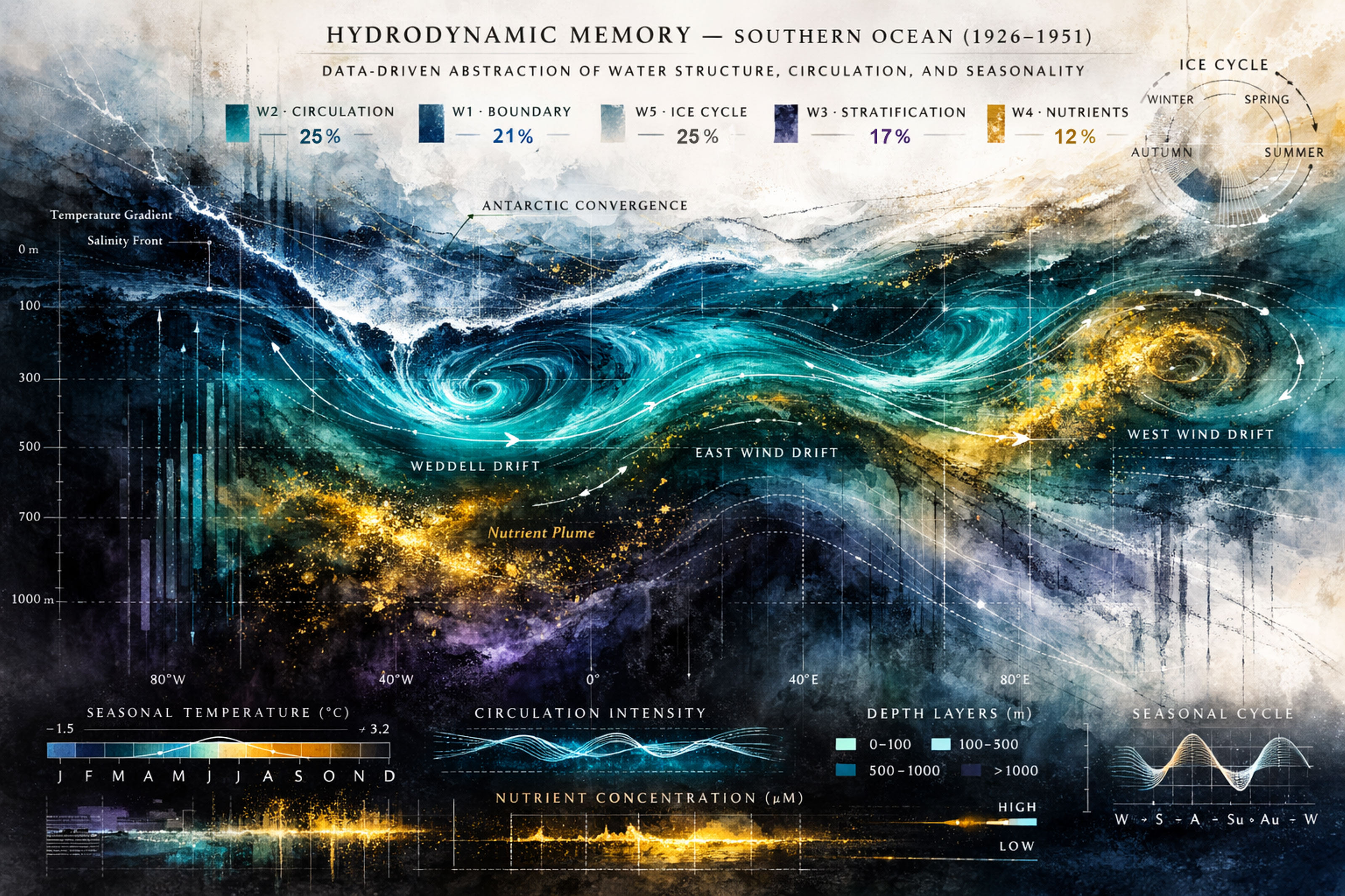
6.1 ‘Hydrodynamic Memory’: a data visualisation poster.
Category: Circulation, 25 percent
The Weddell Drift, East Wind Drift, West Wind Drift and horizontal advection (horizontal transport of water properties).
| Visual Element | Description |
|---|---|
| Spatial Allocation | Approximately one quarter of the canvas |
| Form | Curved motion fields and vortex structures |
| Colour | Teal gradients |
| Layer Interaction | Flow lines overlay depth layers |
| Encoding Principle | Circulation represented as motion geometry |
Category: Ice Cycle, 25 percent
Seasonal ice expansion and retreat, and annual oscillation.
| Visual Element | Description |
|---|---|
| Spatial Allocation | Upper quarter of the composition (because sea ice forms at the surface, and in the composition of the artwork, the upper area represents the surface ocean). Circa one quarter of the canvas. |
| Form | Radial shapes representing cyclical behaviour |
| Colours | Pale cyan and white |
| Light Treatment | Increased luminosity to indicate surface reflection |
| Encoding Principle | Ice represented through cyclical compression and tonal lightness |
Category: Boundary Fronts, 21 percent
Antarctic Convergence, and sharp changes in temperature and salinity.
| Visual Element | Description |
|---|---|
| Line Structure | Strong horizontal seams |
| Contrast | High-contrast white streaks |
| Edge Quality | Sharper edges than the circulation curves |
| Encoding Principle | Boundaries represented as divisions |
Category: Stratification, 17 percent
Stratification is the layering of ocean water at different depths due to changes in temperature and salinity. The scientists collected water samples at different depth intervals, often at fixed levels such as 0 m, -10 m, -50 m, -100 m, -200 m, -500 m, -1000 m and deeper, using sampling bottles lowered on cables, so each depth layer was measured individually rather than averaged.
| Visual Element | Description |
|---|---|
| Colour Progression | Deepens from teal to indigo to violet with increasing depth |
| Saturation | Decreases downward |
| Form | Horizontal layering bands |
| Encoding Principle | Stratification represented as density layering |
Category: Nutrients, 12 percent
Phosphate concentrations of approximately 1 to 3 micromoles per litre in surface waters and higher silicate at depth.
| Visual Element | Description |
|---|---|
| Form | Gold clusters and luminous plumes |
| Spatial Placement | Concentrated at mid-depth |
| Density | Particle density proportional to nutrient weighting |
| Encoding Principle | Nutrients represented as concentrated fertility |
Additional Data Parameters
Seasonal temperature range measured:
| Minimum | Maximum |
|---|---|
| -1.5 °C | +3.2 °C |
Cold values are encoded as deep blue and violet tones. Relatively warmer zones transition toward green and gold.
Depth Markers:
| Sampling Depths |
|---|
| 0 m |
| -100 m |
| -300 m |
| -500 m |
| -700 m |
| -910 m |
| -1010 m |
These correspond to actual Discovery sampling intervals and are represented through tonal shifts and grid references.
Longitude Transects:
| Longitude Lines |
|---|
| 80°W |
| 40°W |
| 0° |
| 40°E |
| 80°E |
These represent Antarctic lines where the research ships repeatedly travelled and collected measurements along the same longitude routes (80°W, 40°W, 0°, 40°E, 80°E). In the artwork, these lines act as fixed horizontal reference points that organise the composition. The lines are translated as subtle vertical grid or faint vertical divisions, slight tonal shifts, repeating vertical intervals, and points where colour intensity or layering slightly changes. They are not drawn as literal map lines.
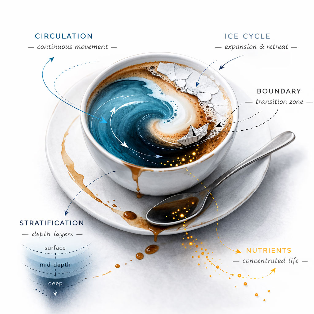
6.2 ‘Ocean system in a cup’: imaginative graphic/illustration.
Category: Circulation, 25 percent
| Visual Element | Description |
|---|---|
| Spatial Allocation | Approximately one quarter of the visible liquid surface |
| Form | Swirling blue vortex at the centre-left of the liquid |
| Colour | Teal and deep blue gradients |
| Motion Quality | Expansive, continuous rotation |
| Scientific Scope | Weddell Drift, East Wind Drift, West Wind Drift and horizontal advection. The single vortex visually condenses these drift systems |
| Encoding Principle | Circulation is represented as a rotational motion geometry |
Category: Ice Cycle, 25 percent
| Visual Element | Description |
|---|---|
| Spatial Allocation | Approximately one quarter of the composition, positioned at the surface/rim of the cup |
| Form | Fractured white crescent |
| Colour | Pale cyan, white and silver tones |
| Motion Quality | Radial compression and outward release suggesting seasonal oscillation. The cracks and segmented edges create the sense that the shape is pushing outward from the centre of the liquid. |
| Scientific Scope | Seasonal expansion and retreat of sea ice recorded across annual cycles |
| Encoding Principle | Ice is represented through cyclical expansion and contraction |
Category: Boundary Fronts, 21 percent
| Visual Element | Description |
|---|---|
| Spatial Allocation | A narrow transitional band between the white ice crescent and the darker liquid |
| Form | A sharply defined tonal seam, separating pale and deep blue zones |
| Contrast | High contrast at the boundary to indicate abrupt temperature and salinity gradients. |
| Scientific Scope | Antarctic Convergence and frontal crossings, documenting sharp changes in temperature and salinity. |
| Encoding Principle | Boundary fronts are encoded as visual divisions rather than expansive fields |
Category: Stratification, 17 percent
| Visual Element | Description |
|---|---|
| Spatial Allocation | Gradual darkening toward the centre of the cup |
| Form | Horizontal tonal transition from lighter surface hues to deeper indigo and violet tones |
| Colour / Saturation | Saturation decreases downward to represent increasing density and reduced light penetration |
| Scientific Scope | Extensive vertical sampling at fixed depths, from 0 m to beyond -1000 m, documenting layered temperature and salinity structure |
| Encoding Principle | Stratification is represented through vertical tonal layering and controlled saturation shifts |
Category: Nutrients, 12 percent
| Visual Element | Description |
|---|---|
| Spatial Allocation | Luminous particles are dispersed within the darker central region, because nutrient concentrations were recorded at mid-depth and deeper layers |
| Form | Fine golden particulate clusters and small glowing plumes |
| Colour / Light | Bright gold tones with heightened luminosity that symbolise fertility and biological activation |
| Scientific Scope | Recorded concentrations of phosphate and silicate linked to plankton productivity and the wider marine food chain, including krill and whale populations |
| Encoding Principle | Nutrients are encoded as concentrated luminous particles: spatially modest yet visually intense, reflecting lower frequency but high ecological significance in the dataset |
Structural Tensions in the Composition
The image also encodes structural tensions derived from the dataset:
*Flow versus Boundary* The spiral motion field meets a sharp tonal seam, reflecting circulation interacting with convergence fronts.
*Surface versus Depth* The illuminated upper layers contrast with the darker central basin, representing light-rich biological zones above and nutrient-rich storage below.
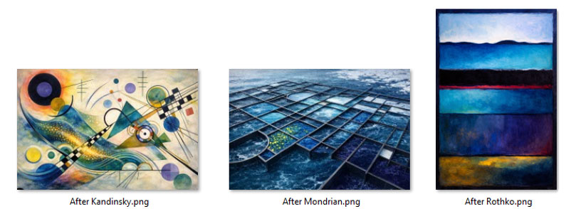
6.3 Re-interpreting famous artworks
Reinterpreting art is a useful exercise as it tests whether empirical data can inhabit established visual languages. It reveals how scientific structures can be translated into recognised systems of abstraction rather than merely illustrating the data descriptively.
After Wassily Kandinsky
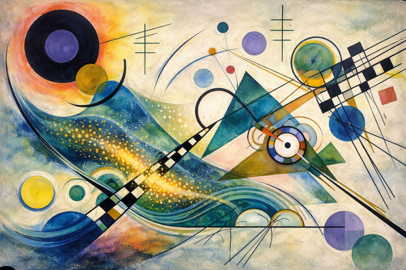
Why the artist is relevant: Kandinsky focused on movement, rhythm, inner force, and structural abstraction. His compositions translate invisible energies into geometric tension, line direction and colour vibration, which is ideal for encoding circulation, boundary, and oscillation.
| Category | Visual Behaviour | Kandinsky Composition |
|---|---|---|
| Boundary Water | Hard edges, intersecting lines, sharp divisions | Thick black linear structures crossing the centre and cutting through coloured forms, creating angular intersections that interrupt movement |
| Circulatory Water | Diagonal arcs, sweeping curved vectors, directional flow | Large curved lines. Flow is created as the viewer’s eye moves from one coloured form to another. |
| Stratified Water | Overlapping planes, tonal layering, stacked depth | Layered coloured shapes placed behind and partially obscured by others, with cooler hues receding to suggest vertical depth |
| Nutrient Water | Small concentrated nodes, high chromatic intensity | Smaller circular accents and saturated colour points, visually compact but bright |
| Ice Cycle | Expanding and contracting circular mass; radial outward and inward force | Oscillating blue ‘waves’ surrounded by a white backdrop. Circle masses. |
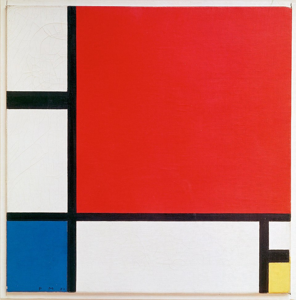
After Piet Mondrian
Why the artist is relevant: structure, boundary, system, reduction. His grid aligns with convergence fronts and proportional datasets.
An original work by Mondrian, as an example:
The re-imagined work for this project, after Mondrian:
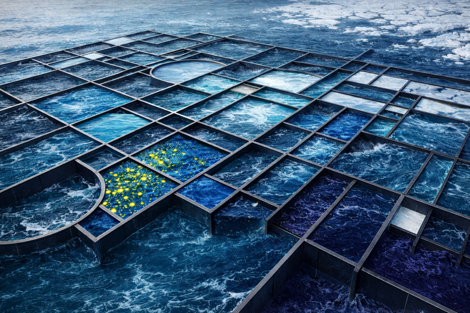
The initial idea for the art was to re-imagine Piet’s signature black lines as 3D metal-structured grid laid on the ocean’s surface. This was purely a creative idea, which I saw in my mind. It was a moment of artistic inspiration, not derived directly from the dataset. Mondrian is known for abstracting nature, so I thought that it would be interesting to take his structure and reapply it back to nature, so to speak, by laying it on the surface of the ocean.
The other decisions were more analytical:
Approximately one quarter of the total surface area was assigned to teal and turquoise rectangles representing circulation systems (the Weddell, East Wind and West Wind drifts).
A further quarter was allocated to pale cyan and near-white blocks representing the seasonal ice field.
Boundary, weighted at 21 percent, was translated into the thickness and placement of the metal grid lines, with stronger horizontal divisions marking convergence fronts. In the dataset the Antarctic Convergence appears as a predominantly east-west (latitudinal) boundary, structuring the ocean through sharp horizontal gradients in temperature and salinity rather than vertical separation.
Stratification at 17 percent informed the vertical stacking of deeper indigo and violet fields.
Nutrient, at 12 percent, assigned to green-gold panels and speckled textures. The green colour, against blue and yellow/gold, looked a bit like marine algae (which is not relevant to the art and dataset), hence I removed it from the version you see here.
The compositional logic followed Mondrian’s reductionist principles but replaced primary colours with oceanographic encoding. Grid proportions were not arbitrary; rectangle sizes were scaled to approximate the dataset weights, meaning larger blocks correspond to higher thematic dominance.
Mondrian used squares/rectangles. I decided to add semi-circles/arcs, to represent circulation, lateral movement within a rigid structure.
After Mark Rothko
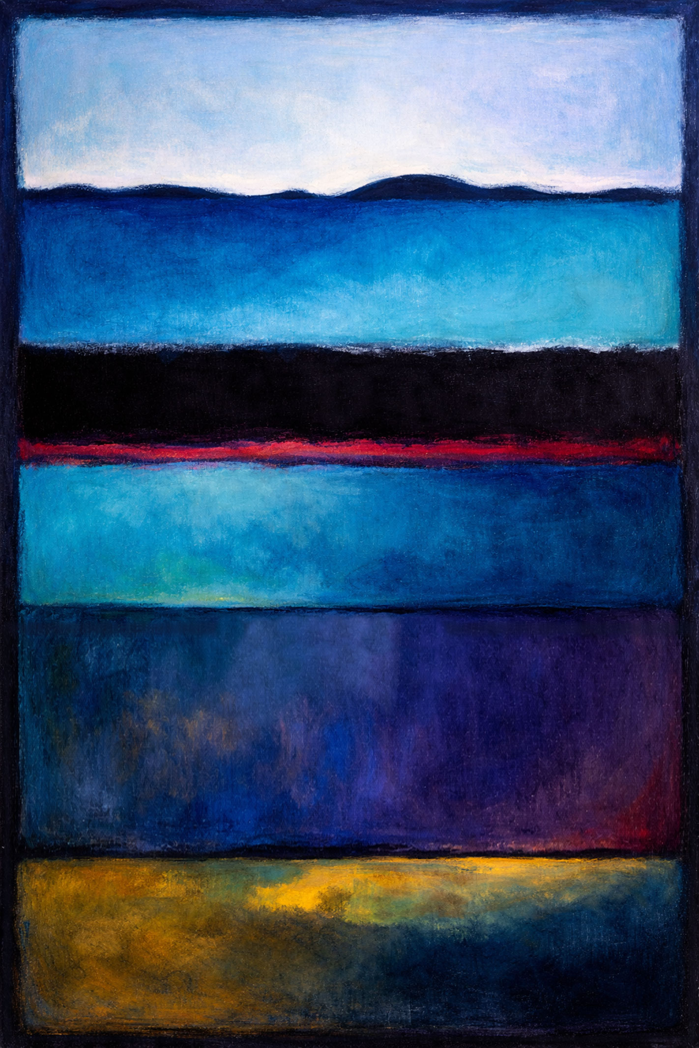
Why the artist is relevant: Rothko’s vertical stacked colour fields can mirror ocean layering and systemic tension, suitable for encoding stratification, boundary forces and seasonal oscillation.
| Category | Dataset Weight | Visual Encoding in the Painting | How the Proportion Is Represented |
|---|---|---|---|
| Ice Cycle (W5) | 25% | Upper pale cyan and white field | The top band occupies approximately 18% of vertical height; when combined visually with adjacent light tonal presence, it reads perceptually as one quarter, representing surface light and seasonal expansion |
| Circulation (W2) | 25% | Broad teal and blue field beneath the pale band | This band occupies the largest continuous chromatic mass, visually dominant and expansive, reflecting lateral transport and drift systems. It is cut by the thick black and red bands. |
| Boundary (W1) | 21% | Dense horizontal black band with embedded red seam | Its thickness and tonal weight create a strong interruption across the canvas, echoing the Antarctic Convergence and sharp thermal and salinity contrasts |
| Stratification (W3) | 17% | Indigo and violet register below the boundary | Darker tonality suggesting increasing depth, density and pressure |
| Nutrients (W4) | 12% | Lowest deep blue field with concentrated gold luminosity | Limited spatial distribution yet strong biological significance reflected in high chromatic intensity |
Footnotes
https://www.poeticmind.co.uk/journal-creativity-and-inspiration/volume-2-issue-2/looking-at-one-object-and-seeing-different-things-joyce-raimondo-interviewed-by-gil-dekel/↩︎